Behind-the-Scenes: How I created my newest studio paintings
See how I created the pieces in my upcoming collection, Walking Between Worlds
This collection is my first time working with acrylics.
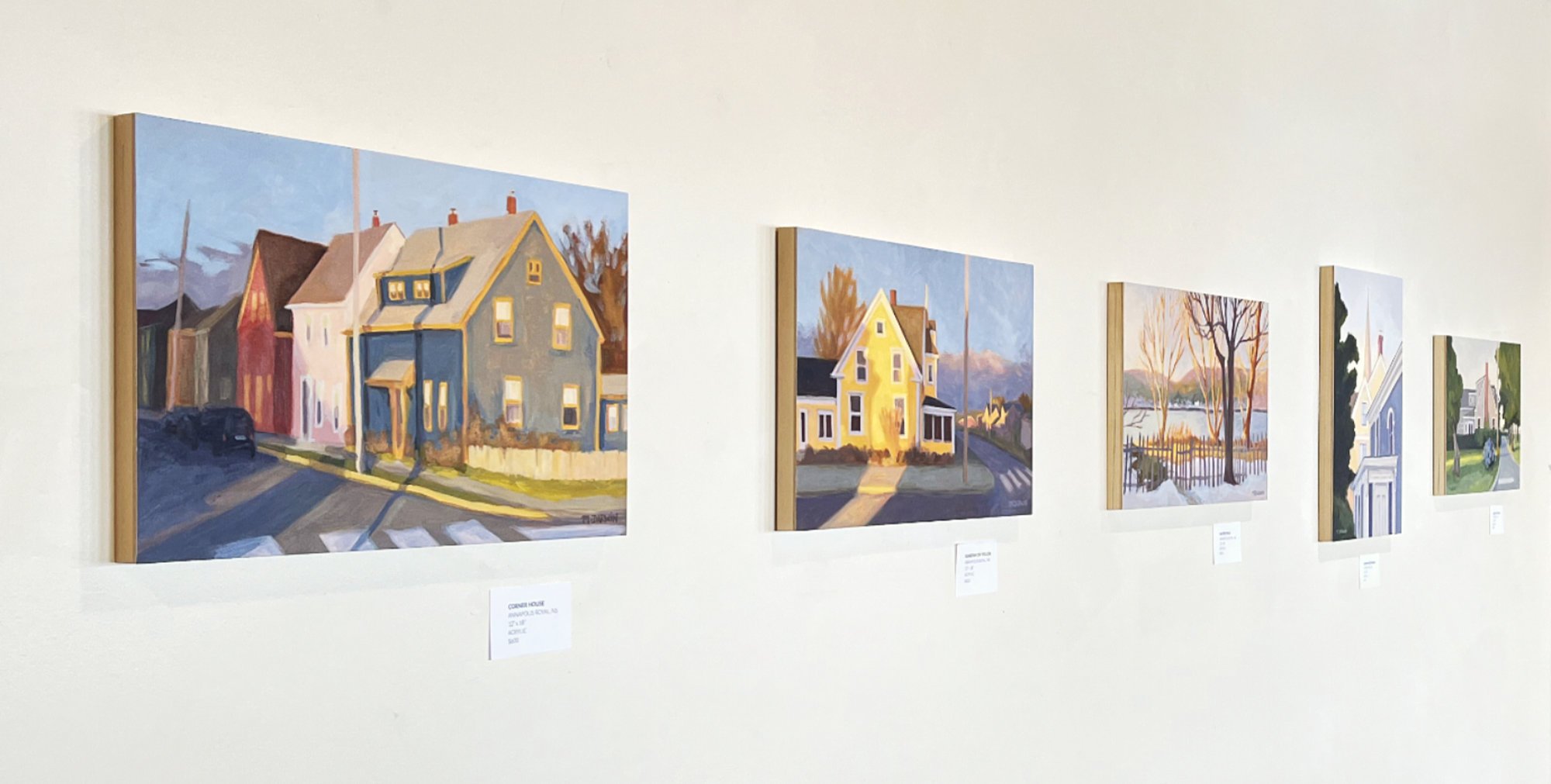
As you probably know by now, walking is my favourite way to get gather ideas for new work. The paintings featured here are part of my upcoming collection, Walking Between Worlds, and capture moments seen while on various walks around Nova Scotia.
The collection focusses on late afternoon, magic hour, dusk, and nighttime scenes. These liminal times have an other-wordly quality to them that I am often drawn to.
When working in the studio, I always take myself back to the feeling of a time or place and do everything I can to hold onto that as I paint. This creates paintings that are rich in evocative mood, colour, and feeling.
New materials & scale
There was a small mountain to climb in the studio to get to these finished pieces. I made them in acrylic, which was a new medium for me. This meant new paint behaviours, new pigments, new brushes…
I also wanted to begin scaling up the size of my work. Typically, my gouache paintings have been fairly small, which can feel wonderfully intimate for both creator and viewer… The paintings in the upcoming collection are 2-3x the size of my previous work. Overall, I loved the larger size – and the feeling of being able to look into each scene more immersively.
I’m happy to have held onto the intimate feeling and the warmth of the colours and light of my previous work, while still exploring the possibilities that are opening up.
Finding ideas
A typical thumbnail sketch and notes showing the key statments, focal point and eye movement, values, and any warm/cool or colour notes I might need.
When I’m ready to begin a new series of paintings in the studio, I usually go through my photos and pull anything that strikes me visually or has a strong memory. Sometimes, I’m looking for images along a particular theme, and other times a theme emerges later in the creation process.
I love to select 1-3 framing ratios and artwork sizes for a project, at the beginning. I also decide early on what materials & colours I will use. This gives me some parameters to work within, which helps me to sit down and get started in the studio each day without feeling overwhelmed.
Once I know my ratios, I create a few simple little viewfinder/thumbnail making tool(s) to enable me to pre-visualize the framing of each painting. In order to select a scene, I squint through the viewfinder at the photo references I’ve gathered. I’m considering various cropping options, the values and composition, as well as what I could to remove, adjust, merge together, or simplify.
I love to select a few ratios and sizes for a project, at the beginning. I also decide early on what materials & colours I will use. This gives me some parameters to work within, which helps me to sit down and get started in the studio each day without feeling overwhelmed.
Creating the painting: Sunbeam on Yellow
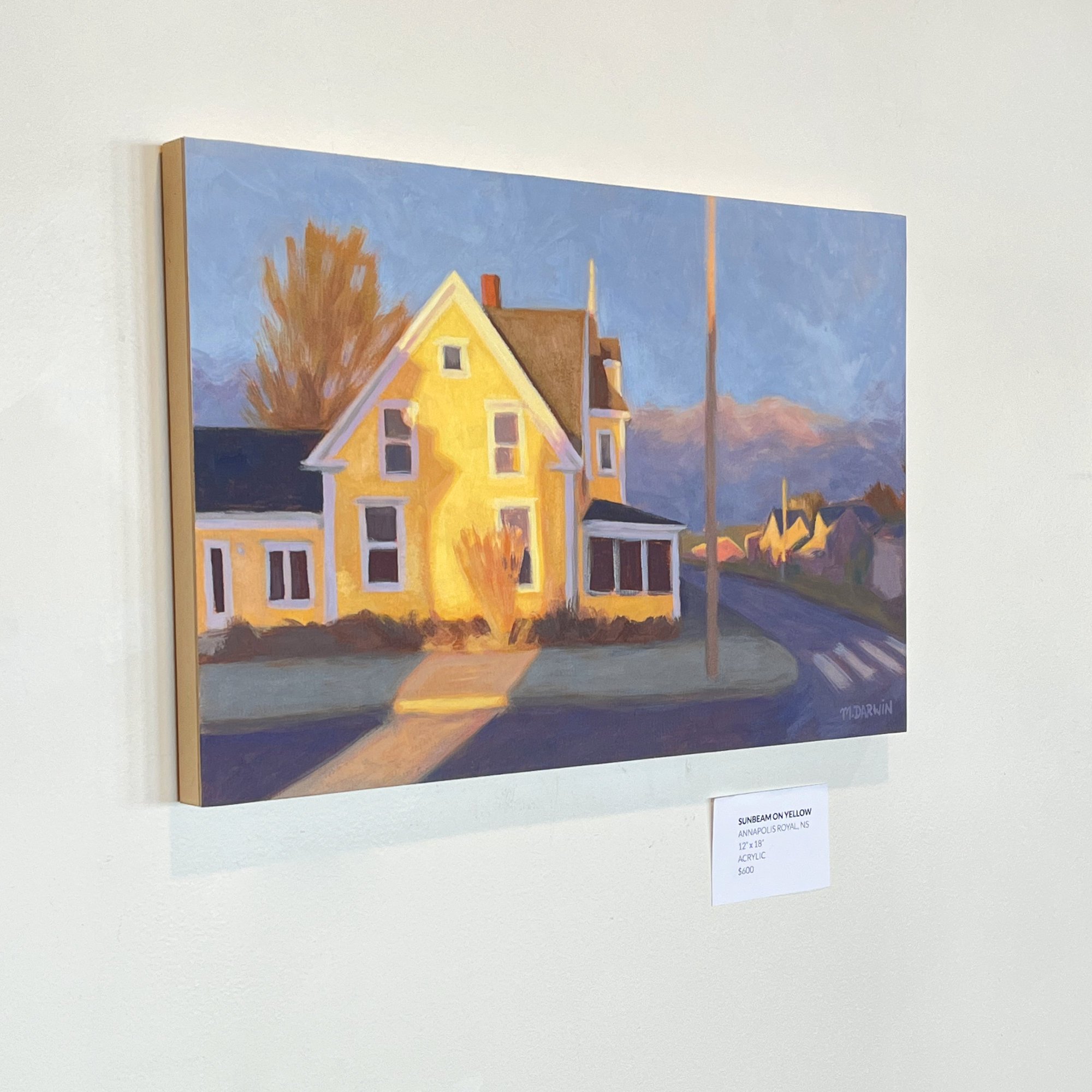
THE FINISHED PAINTING: Sunbeam on Yellow, Annapolis Royal, Nova Scotia. 12”x 18”. Acrylic on paper/panel. A late-afternoon winter sunbeam illuminated the dried grasses and side of this yellow house to stunning effect.
Sketch & notes
Once I have a scene I’m excited about, I decide what I want the painting to be about (the key statement) and list my top three themes.
ALL of my decisions now become about capturing these core ideas.
Next, I create a thumbnail sketch in pencil. This is to show the framing and value structure. Once I’m happy with that, I draw a simple diagram of the focal point and eye movement, as well as a few notes about colour, warmth, and value.
These steps enable me to think through the design of the painting ahead of time and whether I want to keep it within a certain value range or modify my colours to create a certain effect. I rely on these pencil notes while I paint in order to keep myself on track.
Creating the drawing
The under-drawing comes next. I tape up my paper, marked with small lines around the border at the 1/3 marks. This helps me to translate the thumbnail composition to the larger area. I take my time as I draw in the scene, thinking through any design changes, ensuring the perspective is right, and that the composition is strong.
Once I’m happy with the drawing, I tone the paper with a warm brown. (I began doing this after the first couple of paintings in the series in order to prevent any white paper speckles from showing through in the finished painting.)
Where to begin?
Next, I decided where to start the painting. This is different for each painting, but I always ask myself the same question:
“What is the quickest way to convey the painting’s key statement?”
Sometimes, I begin with the strongest colour – if there is one – or with the effect of light/shadow, or even with the largest area of colour. Essentially, I’m looking for whatever is the most defining element of the scene and getting that down as soon as possible. If nothing stands out to me, I begin by placing the darkest and lightest notes in the painting to ensure that everything that follows fits as desired within that range.
In the case of Sunbeam on Yellow, the bright colour of the house and the strong light effect of the sunlight were the most important elements. So, I painted the warm yellow colour of house, first, and then captured the effect of the sunbeam on the post, curb, shrub, and house.
Next, I added in some of the background elements, such as the trees and houses…
… and filled in as many of the larger areas of cooler colours in order to ensure the painting held together as a whole.
I then went in to correct a few details of the house and amplify the effects of light.
The only things left to do were then to fill in a few areas that I’d left incomplete – like the sidewalk – and add a few details – like smaller windows and power poles.
Painting on Paper
You may have noticed that I created these paintings on paper… Previous to working in acrylics for this collection, I’ve ALWAYS worked on paper! First, in pen & watercolour, and then with gouache. My background also includes printmaking and darkroom photography, which are both on paper, as well. What can I say? Paper is what I know and love – at least for now.
Working on paper also allows me to paint freely on a relatively affordable material (watercolour paper), and the pieces can be stored flat in a drawer, which is very valuable when your studio is a spare room in your home!
I did, however, want to create finished paintings that could be hung directly on the wall… This led me to creating a process for working on paper and then mounting chosen paintings on cradled wood panels (more on this, below).
Freedom to explore
Acrylic paints and bruses have some unique properties that opened up new ideas for me… The paint dries quickly (and doesn’t rewet if layered on top of), and the brushes have relatively stiff bristles.
I quickly discovered that I could mix the colour for an area of the painting and begin scratching it in roughtly with a large brush. If I adjusted the colour as I went, I was able to create a variety of surprising colour combinations and overlays. This created fabulous marks and layers of colour that got me excited about the possibilities!
I look forward to experimenting further and seeing where it might lead.
All-together, this process combines my personal use of colour & light with the beauty of watercolour paper, a delicious matte finish, and the elegant contrasting material of the wood panel edges. The end result is just SO simple & elegant… I love it, and hope you will, too.
Mounting & Finishing
While these paintings could be framed behind glass as-is, I preferred the idea of them being ready-to-hang.
I have long loved the look of wood painting panels, so I opted to mount the paintings onto panel. I’ve placed a wire behind the panels that allows them to hang perfectly flush to the wall. (They can be placed in a floater frame, if desired.)
I left the sides of the panel their beautiful light natural wood colour.
A lifetime of enjoyment…
Finally, the paintings were varnished with a VERY matte finish varnish – the most matte I could find!
Adding a varnish seals the painting (especially important to me because the work is on paper, and sometimes painted fairly thinly), giving the pieces a lifetime of UV and moisture protection. All materials are professional/archival quality and should last a lifetime if well cared for.
It also gives the paintings an absolutely gorgeous finish!
One of my favourite things about painting with gouache has always the very flat finish it has, and it took me some time to get used to the light sheen of acrylic paints. I tried quite a few different varnishes before settling on my final choice. The finish I opted for evens everything out to mimic the matte texture of the watercolour paper itself – and the best part is, you don’t have to frame it, so you can enjoy the beauty of watercolour paper directly on your wall – safely! – for years.
All-together, this process combines my personal use of colour & light with the beauty of watercolour paper, a delicious matte finish, and the elegant contrasting material of the wood panel edges.
As you can see, it takes many steps to go from idea to finished painting, but the end result is just SO simple & elegant…
I love it – and hope you will, too.
BONUS: More behind-the-scenes…
A few additional process pictures of other paintings in the collection…
THE FINISHED PAINTING: Corner House, Annapolis Royal, Nova Scotia. 12" x 18". Acrylic on paper/panel. This is a street corner in Annapolis Royal, shown in late afternoon light. I loved the long shadows cutting across the scene and the warm light illuminating the various house façades.
Artist’s Note:
NEW COLLECTION NOW AVAILABLE! The paintings in this post are part of my newest collection of original paintings, Walking Between Worlds.
Join my Studio List to be the first to see new collections! This collection was also featured at my solo show!
* * *
MORE BEHIND-THE-SCENES:
Everyone loves to peek behind the studio curtain! Go behind-the-scenes of how I created the gouache paintings in my New Horizons Collection or see how I create my popular tan-paper interiors + learn about my extremely simple DIY plein air setup in how I paint from life.


